Friday 26 March 2010

The Hunted - Main trailer

This is the main 'The Hunted' trailer, it lasts approximately two minutes in which I have recognised is the average time length for teaser trailers. The purpose being to project the narrative and content of the film however, building up tension and ending on a cliff-hanger.

I feel that I have applied and used the codes and conventions featured in horror trailers, an example being the darkness of the lighting in the forest to reflect the mysterious feeling.

The Hunted - 30 second trailer

To reflect my editing skills I created a 30 second trailer, this trailer reflects and reveals the most important and narrative structured clips involved in the main trailer. Thirty second trailers are often viewed as being conventional as they usually appear before a genre related film, intervening the most influential and exciting moments.

Ancillary Text 2 - Film poster


For the second ancillary text I created a film poster to combine and work well with the horror film trailer. The image I have chosen reflects the cold and mysterious mood in which I am wanting to create, again fitting with the generic conventions of horror. The shape of the tree also works well with the posture of the main character as it blocks off the bottom off the figure, therefore focusing on the reaction on the character's face.
I have applied the headline 'The Hunted' towards the bottom half of the poster, so that it doesn't take too much attention away from the main image however does attract the reader.
By adding alternate factors such as; advertisements of the film at the bottom of the poster (website and release date), credits, textual phrasing and recognised logos such as the 'Restricted' logo projects an element of verisimilitude and proffesionalism as it is applying and using the generic conventions required for a successful looking film poster.

The poster would be produced in an A4 page format and would be included within the film magazine 'ACT!ON'.

Ancillary Text 1 - Film magazine front cover


For my first ancillary text I decided to create a film magazine front page. As for my Foundation Portfolio I had to create a music magazine front page I collated experience and an understanding into the creation of magazine front covers. By analysing existing, contemporary film trailers I gathered the generic conventions required for Horror trailers and applied them to my front page.
The location in which I took the image is at Hessle Foreshore as this location appears very similar to the location in which I used in the trailer. I wanted there to be a vast amount of detail happening on the front page perhaps to reflect the hectic and upbeat filming world, therefore I applied conventions such as scremers 'Win win and...win!' to attract and catch attention. In order to give an insight into the magazine and create verisimilitude I included two images which look as they have been taken in an album therefore perhaps indicating 'behind the scenes' footage.
Overall I am pleased with the front page film magazine and I think it combines well with 'The Hunted' horror trailer.

Release form


Test shots

Before producing and shooting the final trailer, I decided to take test shots at the main location. However the main character featured was the main original character which I was going to use, due to work commitments she could no longer carry on with the filming.

I think that by shooting test shots it gives you the opportunity to view the framing and whether the location is suitable for the final product. The first major aspect in which I needed to improve on was the framing, as you can see the framing is very poor on both of the test shots. Therefore, I could take this away with me to discover the best and appropriate way in how to frame a suitable shot.

Another area in which I came to recognise was the diegetic sound in which the video camera recorded, as you can see when both chacters are walking away in the first shot the quality of sound was very poor and they could hardly be heard. This is another aspect in which helped me when it came to shooting the final material.

I discovered that in the first shot a building in the background is slightly visable, therefore I was aware that when filming for the final product I needed to be consciously aware of any confounding variables (variables which get in the way) which could possibly get in the way of the filming.

Thursday 25 March 2010

Before and after manipulation


Here are the images I have chosen to use for the two ancillary texts before and after being manipulated. Both images have been colour manipulated on the program Picasa, and have both used the same tool. The tool in which I have used is better known as 'focal black and white' (featured below). Therefore, this allowed me to transform both images in a black and white format and then select the area of the image in which I wanted to be featured in colour (the facial area).


Here are several effects provided by Picasa, as you can see the tool in which I used is highlighted. However, I enlargened and selected the focal colour point on the image.

Edit log


To keep a record of how long and what I've edited I kept an edit log, I found this extremely useful as it kept me organised and helped me know were abouts I was at with the project. It also has distinguished who has edited what in the horror film trailer.

Extra Elements

To make my trailer and two anxcillary texts appear more realistic I created my own production logo which will feature at the beginning of the horror teaser trailer, therefore displaying a convention of trailers and will also project my creative aspect as I have created my own production logo better known as 'Tower Productions'.


I have added the 'Restricted' logo to my my poster and at the end of the horror trailer, displaying realism to the trailer. It is also featured at the bottom of the film poster in which I created, it could also be viewed as possibly reflecting the genre of the film by showing the audience that persons under the age of 18 must be accompanied by an adult.


Another feature in which I have added to the film poster is the Dolby Digital logo to represent and create verisimilitude, projecting a sense of professionalism to the film poster.

Wednesday 24 March 2010

Questionnaire about 'The Hunted' trailer

To gather audience feedback about 'The Hunted' horror trailer I created a questionnaire with nine questions asking both open ended (questions which gives the participant to expand their answer, rather than just being restricted to set answers eg. 'yes' and 'no') and fixed choice questions (set answers for example 'yes' and 'no). Therefore by producing open and fixed choice question this allows the data to be quantitative (number form and easy to analyse) and qualitative (allows me to view the opinions of the participants).
To avoid the results being biased I asked random individuals who came into the classroom to watch the film trailer and answer the questionnaire in which I handed out.

Ideas for the name of the film trailer


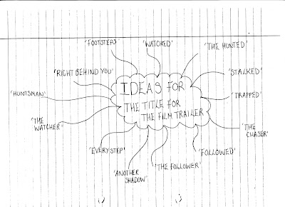
An important aspect when creating my horror film trailer is choosing the correct and approriate name for the trailer. I began by creating a brainstorm of ideas in which I thought up, all of the names i chose all had similarities and were somehow connected with 'stalkers' almost creating a semantic field of words linked with stalkers and followers.
Several examples analysed:
TRAPPED- 'Trapped' definately projects the genre to the audience as it shows to the audience that the film will be based around a follower and a definate victim who may become trapped and hunted down at one point during the film.
EVERY STEP- The name 'Every Step' could be seen as subtle compared to 'Trapped' as it is not giving away to many clues about the film itself, however the two words reveal to the audience that the synopsis of the film could possibly be about many footsteps being followed!
ANOTHER SHADOW- 'Another Shadow' creates a very mysterious and creepy atmosphere about the film as it reflects there is another character involved possibly lurking in the background behind the main character 'Amelia Roberts'.

I have decided to go with the name 'The Hunted' as it immediately estbalishes to the audience the genre of the film and perhaps also reflecting the synopsis, it could also be associated with future events which could possibly occur in the film itself such as 'Amelia Roberts' being hunted down leaving an element of ambigousity to the reader.

Thursday 11 March 2010

Preperation - ACT!ON (film magazine name) font types


When looking at this font 'Action of the time' it projects a creative aspect and appears very unique as it is slightly slanted and also features random lines and white shapes scattered inside the letters. I think this would definately be a suitable font to use for my magazine name as it could perhaps reflect the originality of the magazine itself.


This font could be seen as similar to the one above, however is straighter and more in line. I like the appearance of the font as it looks punchy and original in style, and could definately reflect the magazine itself.


The first aspect I noticed about this font is the attention to detail and the faint shadow behind the lettering, this makes the font appear bold and lets it stand out!


When first looking at this font I thought of it being very retro and unique, however i think the style of font works very well with the piece of text 'ACT!ON' as the letters are different and give an extra edge to it.


The effect of this font is that it appears like it is moving therefore the tips of the lettering appear blurry, which i really like as it could be associated with the fast progressing films which are being released.


Again this font also appears retro and funky, the way in which the letters are joined together makes the piece of text appear smart and well presented and could possibly reflect the magazine.